Last updated on 3 days, 20 hours ago.
This is one of the things that I did.
Turbie's Tiny Sticky Note
If you're looking for a basic timeline, check out this instead.
Past Update:
19 Aug 2026
Release.
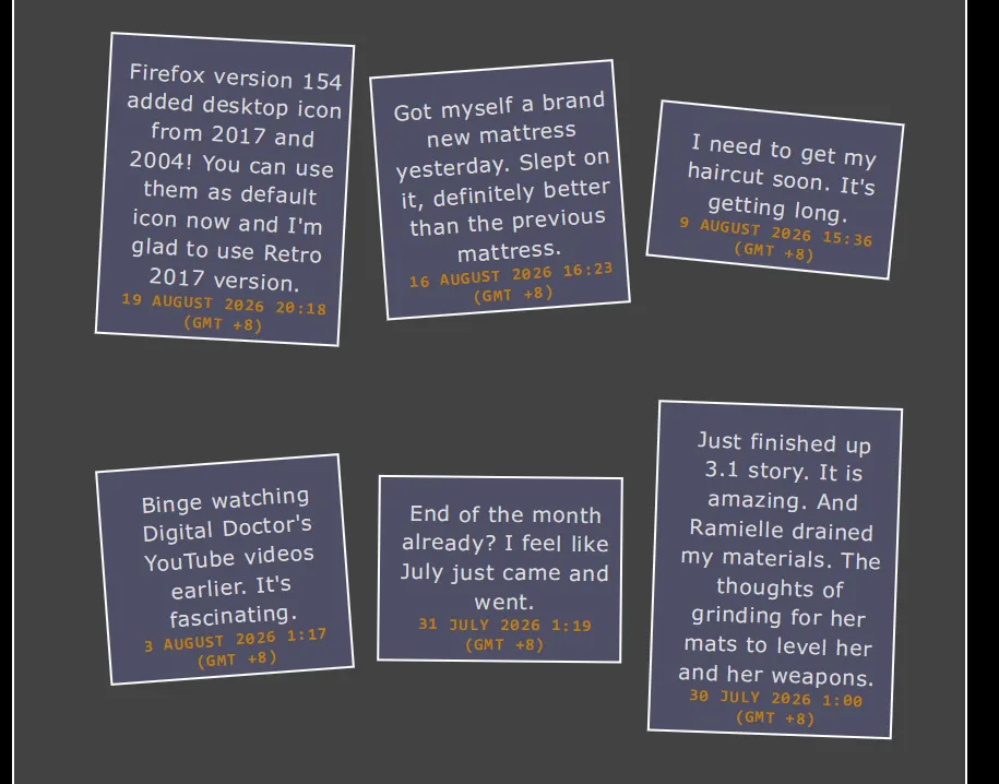
Tiny notes in action.
This is inspired by Sylvia's sticky notes, which was inspired by Katherine Yang. So here is my version of it.
I like the idea where instead of having it as a regular timeline, why not make it a box and rotate it. And while we're at it, simplify it. Both the code, and using simple markdown rather than individual posts1. And by simplify the code, I mean, simplify enough that if you want to add something to it, you can but otherwise, it's enough to get you started.
Sylvia does have something similar to this but it requires external font-family.
And do forgive me for the code mess. Haha.
Best used with my Palettes as external palettes may not use or call
nav-colorthe same.
Click this to view it's CSS:
CSS Code:
/* Timeline rotate | turbiegaming.bearblog.dev */
/* version 0.7.0 */

.timeline-notes {
    margin-block: 35px;
    padding-block: 5px;
}

.timeline-notes ul {
    list-style: none;
    position: relative;
    margin: 10px;
    inset-block: 0;
    line-height: 1.4;
    letter-spacing: 0.67px;
    align-items: center;
    width: 100%;
    display: flex;
    gap: 28px;
    flex-wrap: wrap;
    flex-direction: row;
    justify-content: center;
    padding: 25px 0;
    text-align: center;
}

.timeline-notes li {
    position: relative;
    padding-inline-start: 15px;
    margin-block: 15px;
    padding-inline-end: 5px;
    border: 2px solid;
    border-color: var(--border-color);
    background: color-mix(in srgb, var(--text-color)23%, var(--nav-color)48%);
    height: auto;
    width: 200px;
    display: flex;
    flex-direction: row;
    flex-wrap: wrap-reverse;
    justify-content: space-between;
    align-items: start;
}

.timeline-notes li:nth-child(odd) {
    rotate:3.2deg;
}

.timeline-notes li:nth-child(even) {
    rotate:-4.2deg;
}

.timeline-notes li:nth-child(3n) {
    rotate:5.72deg;
}

.timeline-notes li:nth-child(5n) {
    rotate:0.66deg;
}

.timeline-notes li:nth-child(6n) {
    rotate:2.6deg;
}

.timeline-notes li:nth-child(10n) {
    rotate:-4.97deg;
}

.timeline-notes li:nth-child(11n) {
    rotate:-7.9deg;
}

.timeline-notes li > :last-child {
    margin-block-end: 0;
}

.timeline-notes h4 {
    margin: 0;
    padding-block-end: 5px;
    font-size: 14.5px;
    line-height: 1.2;
    font-weight: bold;
    letter-spacing: 1.15px;
    text-transform: uppercase;
    color: var(--heading-color);
}
How to Use
The code above needs to paste it into the Theme page.
And then you'll need to paste the HTML markup (below) in a page (it can be a new page or existing one) and keep adding more. And as long as you keep the format within the <div class="timeline-notes"></div> the same as shown, the code will automatically will do it for you.
And best part? You don't need to keep adding <div> class individually (as shown below).
If you want to add a new "short post" within the timeline, all you'll need to do is copy/add the #### Your header and the text accompanied below, either above (descending order) or below (ascending order) the existing ones.
Use case: Short Thoughts that is not post-worthy, blog's updates/changelog or current status2.
Markup HTML:
Markup HTML:
<div class="timeline-notes">

#### 22 July 2026
Your text below.

#### 20 July 2026
Even more text.

#### 31 June 2026
I love McDonald's! I love it because of this and that.

#### 17 June 2026
Here's a text about that.

#### 04 June 2026
The start of timeline!

</div>
Happy blogging!