Last updated on 3 hours, 33 minutes ago.
This is one of the things that I did.
TurBahunYeah!
This layout was inspired by Bahunya theme.
Past Update:
05 Aug 2026
Release.
WARNING: This code is coded based off of Mozilla Firefox usage. It might look slightly off in non-Firefox-based browsers. Mobile viewing is not guaranteed if you have long navigation bar (more than 5 links) or longer than 30-word count1 combined (if less than 5 links in Nav Bar). 4 Links (30-word count or less) in nav bar is recommended if you still want to use this theme.
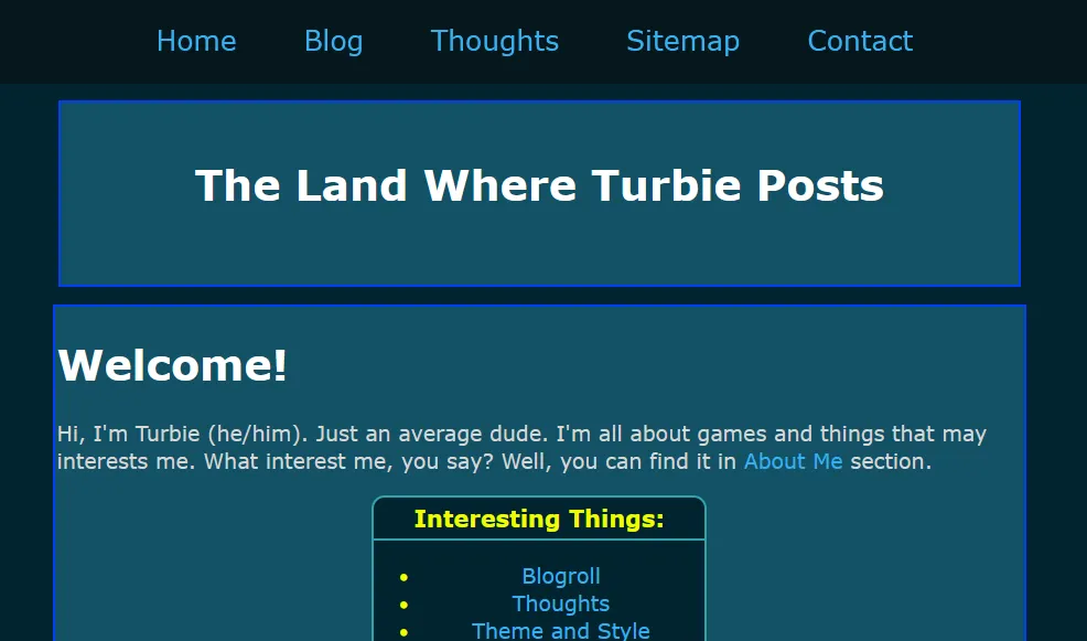
TurBunya Edition.
In the original Bahunya version where the Navigation bar is fixed in a location. My rendition of Bahunya theme is header + Nav being in a fixed location instead. This layout comes with the default bear theme. For more palettes, you can find them here.
If you have class_name (eg. Microblog, photo gallery etc.) on your current theme, please read the class_name section.
Just like the other layouts, it is built for BearBlog.
This layout coded and tested for 1920x1080 and some smartphones.
Do let me know via contact if there is any anomalies, especially if (and only if) you're using a 4k monitor as this is the first time I'm using percentage instead of hard pixel numbers set for certain widths.
Click this to view it's CSS:
CSS Code:
/* Colour palette made by turbiegaming.bearblog.dev/ */
/* Last updated: 22 July 2026 */

:root {
    --max-width: 875px;
    --line-height: 1.5;
    --font-main: Verdana, sans-serif;
    --font-secondary: Verdana, sans-serif;
    --font-scale: 19px;
    --background-color: #01242e;
    --background-secondary-color: #145266;
    --heading-color: #FFFFFF;
    --text-color: #D6D6D6;
    --text-secondary-color: #11D41E;
    --time-text-color: #57B848;
    --link-color: #37AFF0;
    --visited-color:  #AD00FF;
    --border-color: #0040FF;
    --border-secondary-color: #32A1AB;
    --hover-color: #052E3B;
    --hover-secondary-color: #006EA6;
    --nav-color: #06171C;
    --code-background-color: #000;
    --code-color: #BABABA;
    --blockquote-color: #ccc;
}

/* CSS made by turbiegaming.bearblog.dev. */
/* Layout Version 0.4.2 Updated on 05 Aug 2026. */

body {
    font-family: var(--font-secondary);
    font-size: var(--font-scale);
    margin: 260px auto;
    padding: 20px;
    max-width: var(--max-width);
    text-align: left;
    background-color: var(--background-color);
    word-wrap: break-word;
    overflow-wrap: break-word;
    line-height: 1.5;
    color: var(--text-color);
}

header {
    text-align: center;
    padding: 20px;
    margin-bottom: 15px;
    margin-left: 5px;
    border: 2px solid;
    border-color: var(--border-color);
    background: var(--background-secondary-color);
    position: fixed;
    top: 95px;
    width: 43.18%;
    height: 125px;
    z-index: 999;
}

h1, h2, h3, h4, h5, h6 {
    font-family: var(--font-main);
    color: var(--heading-color);
}

strong, b {
    color: var(--heading-color);
}

a {
    color: var(--link-color);
    cursor: pointer;
    text-decoration: none;
}

a:hover {
     text-decoration: underline;
     background-color: var(--hover-color);
}

nav {
    font-size: var(--font-scale);
    position: fixed;
    top: 0;
    left: 0;
    background: var(--nav-color);
    display: flex;
    align-items: center;
    width: 100%;
    height: 80px;
    z-index: 999;
}

nav p {
    width: 100%;
    padding: 0;
    margin: 0 auto;
}

nav a {
    margin-left: 2px;
    margin-right: 2px;
    padding: 25px;
}

nav a:hover {
    background-color: var(--hover-secondary-color);
}


button {
    margin: 0;
}

main {
    background-color: var(--background-secondary-color);
    padding: 2px;
    margin: 2px;
    border: 2.5px solid;
    border-color: var(--border-color);
    line-height: 1.3;
}

@media (min-width: 770px) {
    main {
       width: var(--max-width);
       margin: auto;
  }
    nav a {
       font-size: 25px;
  }
}

@media (max-width: 768px) {
    nav {
     	height: 38px;
  }

  header {
       position: fixed;
       top: 45px;
       width: 79.3%;
  }

  body {
       margin-top: 210px;
  }

    nav a {
       padding: 7px;
}
}

table {
    width: 100%;
}

button {
    margin: 0;
    cursor: pointer;
}

hr {
    border: 1;
    border-top: 1px solid;
    border-color: var(--border-color);
}

time {
    font-family: Lucida Console, monospace;
    font-style: normal;
    font-size: 17px;
    color: var(--time-text-color);
}

img {
    max-width: 100%;
}

code {
    font-family: monospace;
    padding: 2px;
    background-color: var(--code-background-color);
    color: var(--code-color);
    border-radius: 3px;
}

blockquote {
    margin-left: 15px;
    border-left: 3px solid;
    border-color: var(--blockquote-color);
    color: var(--text-secondary-color);
    padding-left: 22px;
    font-style: italic;
}

footer {
    padding: 14px 0;
    margin: auto;
    text-align: center;
    font-size: 15px;
    line-height: 1.2;
    color: var(--text-secondary-color);
}

.title {
    text-decoration: none;
}

.title h1 {
    color: var(--heading-color);
}

.inline {
    width: auto !important;
}

.highlight, .code {
    padding: 1px 15px;
    background-color: var(--code-background-color);
    color: var(--code-color);
    border-radius: 3px;
    margin-block-start: 1em;
    margin-block-end: 1em;
    overflow-x: auto;
}
How to Use
Copy the code above and replace everything in Theme.
P.S: In order to make the theme fully workable, make sure you copy WITH the
:rootthat I included in the code above. Individual:rootpalettes can be found here.
Class_Name
If you currently using any individual class_name(eg. Microblog, photo gallery etc.) and still want to retain/use it after using this theme, the easiest way is:
- save all the
class_nameinto a notepad (or notes app) and replace everything in there with this code. If you're editing directly on a smartphone (or mobile phone, depend on how you call it), or an Apple Tablet (or Galaxy Tab), make sure you "publish" (to save) first. This is to prevent accidental page reload2. - Then go into your notepad (or notes app) and copy the
class_nameyou have available and paste it back in. - Publish it to confirm.
P.S: I am not responsible for external
class_namethat isn't made by me. This is because their call tag (in:root) for colours like text, background etc may be different from mine.